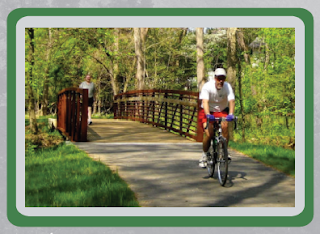
 For the first visual we chose to
have a picture of a well-designed trail that includes people using it and
having a good time. The main purpose of the picture is to engage the reader about
trails and make them interested in using them. It does so by showing people
having a good time while using the trails. The picture isn’t complex and it
does not need to be, since the people that would be reading this brochure would
be average. The picture is not titled or numbered, but there is a caption to go
with the picture and do to its placement in the brochure numbering the picture would
make it seem out of place. Since there is no data included with the picture, no
cites are needed. On the other hand, the caption includes data and that is
referenced. The visual is someone else’s and I did keep the source information to
later acknowledge their ownership. It is not included in the brochure because
it would distract from the focus. The visual can stand for itself since it has
a simple meaning. The visual is uncrowded in the brochure and is appropriate
for the need of the photo, to show trails are fun. Lastly, it is easy to locate
and it is next to the text that goes with it.
The next visual used serves the
same purpose. It shows how a group of people can find trails enjoyable. Yet
again this picture is simple for a simple audience. This picture is not
numbered or titled but does not need to be. The picture’s purpose is to entice readers
while filling space on the brochure. This way the brochure can include the desired
amount of information, while also looking appealing with more visuals for the
audience. Again, the photo can stand by itself due to its simplistic meaning. The
photo shows elderly people having fun, which also makes it appeal to the older
generations. At the same time, it is of a group of people and thus the picture
appeals to families and friends, by communicating a message of togetherness. As
a result of appealing to a wide variety of viewers, it is a great type of
visual to include. Lastly, the photo is easy to locate and is placed next to
the benefits section making it in the optimal place.
The last image is of an area along the trail from Six Mile to Clemson. The image serves the purpose of displaying what part of the trail path looks like. There is a tittle and caption that go with the picture, as well as a location of where the section of the trail goes on the map. As a result, it does not need to be numbered. Since the picture is original, it does not need to be cited. As far as meaning goes, the image could not stand by itself. However it does not need to since it is attached, by a line, to what it represents. It is easy to find and has an adequate amount of borders. Overall, it greatly qualifies for the type of picture needed for an additional picture on the map.
-Alex Whitman


No comments:
Post a Comment